Composite Images using Image Masks
In my last post about dynamic pattern images , I showed how to create images on the fly for use as background pattern images. As promised, today I’ll show how to create composite images with cutouts using masks.
Building on the sample project from last time, I have changed the background pattern image to a red diamond on a black square. This shows the effect of using a mask to create an image much better later.
When thinking about creating images on the fly, it is reasonable to assume that you’ll need to draw some lines or create and fill some paths. The original example does exactly these things: fills the square with black, and draws and fills a diamond shaped path with (now) red. Within a single context, we can draw as much as we want like this to produce an image.
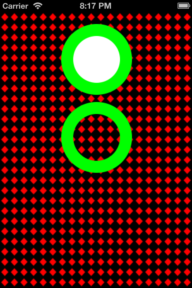
In the first add-on to the sample project, I’ve added a UIImageView with a “filled doughnut”. That is, a green ring, with a white center. The method -filledDoughnutForSize: takes care of producing the image. Quite frankly, it is not much different from the method -patternImageWithSize:forRectSize: from the original example. In the screen shot below, you can see that the green circle with the white inner circle appears as advertised.
Now, what if I really want a ring, with an open center? One cannot draw using clearColor, although that might be your first inclination. Here’s where using a mask comes in. The idea of a mask is to cover with a color (white) everything in your original image that you want to keep, and cover with black everything you want to discard from your original image.
The second new method -emptyDoughnutForSize: does exactly this. The first part is just like before: we draw a green circle in the DeviceRGB color space to produce imageRef. Next, instead of drawing a white, inner circle, we have to produce a new image that we’ll use as a mask.
A mask is created using a DeviceGray color space. This makes sense, because a mask only needs to identify two things: what to keep and what to discard. We start off by coloring the whole image white. This means: keep everything. Next, we draw our inner circle in black. This is what we’ll discard from the original image. From this context, we create maskImageRef.
The magic happens by calling CGImageCreateWithMask() to combine imageRef and maskImageRef. The result, a green ring with a hollow center, is shown below. You can see how the diamond pattern background shows through. Cool, no?
Update
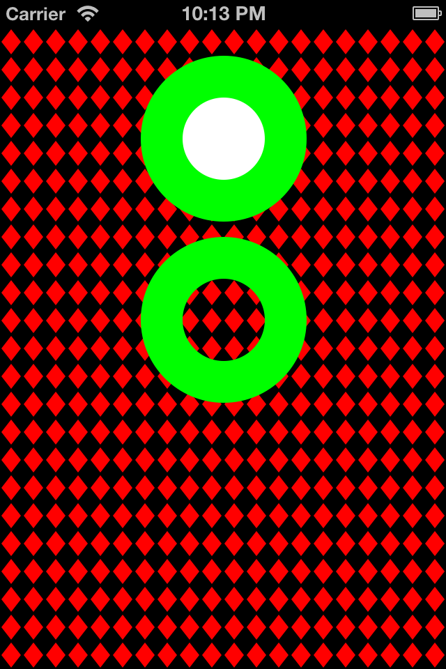
Reader Marc Respass noted that the images generated were not high resolution for Retina displays. You can see our exchange in the comments. Indeed, if you look at the green circles in the image above, produced with the Retina iPhone4 simulator, they appear jaggy. Now look at this image:
This is truly a 2x resolution image, because that is how the images for this example were generated. And the solution was pretty simple.
In the sample code in the -viewDidAppear: method, there are a couple of changes required. First, we have to make sure that our images are created with enough pixels. A Retina image has twice the pixels as a non-Retina image. So our 16×16 pixel pattern image, for a Retina display, really needs to be 32×32. We can do this dynamically using an affine transform:
[code lang=”objc”]
CGFloat scale = [[UIScreen mainScreen] scale];
CGAffineTransform transform = CGAffineTransformScale(CGAffineTransformIdentity, scale, scale);
[/code]
On a Retina display, where the scale will be 2, this creates a transform we can use to size-up by 2 any CGSize. So when we create the pattern image, we can apply it like so:
[code lang=”objc”]
// Create a 16×16 image that is a red diamond on a black background
UIImage *image = [self patternImageWithSize:CGSizeApplyAffineTransform(CGSizeMake(16,16), transform)
forRectSize:CGSizeApplyAffineTransform(self.view.frame.size, transform)];
[/code]
Note that we not only scale up our desired image size, but for the purposes of this example, the target frame size the pattern image will be used to fill. (This is a nuance of the type of pattern I am trying to create so that it fills the frame without being cut off.)
Now, in the method -patternImageWithSize:, there is one more secret. The image returned is created using the more robust UIImage class method +imageWithCGImage:scale:orientation: which lets us specify that the created images scale is, in this case, 2x. The magic of the SDK and iOS then displays the image in a 1x area, resulting in a high resolution presentation.
Creating the doughnuts requires similar changes. We can reuse the transform created above, and apply it to the CGSize arguments in the calls to the doughnut methods:
[code lang=”objc”]
// Create a UIImageView, and an image
UIImageView *imageView = [[UIImageView alloc] initWithFrame:CGRectMake(100, 20, 120, 120)];
imageView.image = [self filledDoughnutForSize:CGSizeApplyAffineTransform(imageView.frame.size, transform)];
[/code]
I included the UIImageView creation to highlight that we don’t have to up-size its frame. We only need to up-size the image we want to put in it. And sure enough, the new doughnuts’ edges are much more crisp.
Very cool indeed. I’ve updated the Github project.


This is a great article. Thank you. I found that it doesn’t draw correctly on the Retina display. I added CGFloat scale = [[UIScreen mainScreen] scale]; to the top of the various methods and multiply (width, height, offset) by the scale to adjust the sizes and then everything looks good. Is that the right way to go it? I don’t know any other way of determining retina than [[UIScreen mainScreen] scale].
Hi Marc. I’m surprised you had to make this edit. I built the app and ran it without issue on all the simulators and on my Retina iPhone4. The display appeared just like the screenshot in the article. Interesting that adjusting by the scale factor would “fix” this (it makes sense). At least for me, however, that isn’t needed. Weird, to say the least. I am using the latest Xcode (4.5.x), iOS6, etc. You?
Hi. I am running the latest OS X, Xcode, and iOS 6. Here are two screen shots of the 3.5″ Retina display simulator when run with scaling applied and without.
https://www.dropbox.com/sh/4ihfdpsi7i02btb/jlEKQ-jlhj
You can see the difference. My simulator was set to pre-retina iPhone and it looked great. When I switched to retina, the image got jagged. I’ve seen scaling applied in other places which is what made me think of it.
Ah! I see what you’re saying.
I was going to chalk this up to running in the simulator, because unless you have a Retina MacBook Pro, your Mac’s display is not a Retina display. So why would you expect to see Retina resolution in the simulator?
However, I did some digging, and there is a better way to fix this. In both doughnut methods replace the lines like this:
[code lang=”objc”]
UIImage *image = [UIImage imageWithCGImage:imageRef];
[/code]
with this:
[code lang=”objc”]
UIImage *image = [UIImage imageWithCGImage:imageRef scale:[[UIScreen mainScreen] scale] orientation:UIImageOrientationUp];
[/code]
Now, interestingly, this method creates images both of the correct scale and visual size for the composite “doughnut” images. But when +imageWithCGImage:scale:orientation: is used for the basic pattern image (the diamond), the resulting image for Retina displays is half size. I am not sure why that is…
But the above change for the composite images definitely yields a nicer image.
That is a much better solution. Thanks again for the article and the responses.
My pleasure. Thank YOU for your input. It’s nice to know that a) someone reads these posts, and b) finds them interesting or useful. 🙂
By the way, the docs say that CoreGraphics handles scaling issues automatically. So I am a little confused why anything special is needed. It may be that for the “simple” pattern image, CG is doing what it says it should be doing, and there is something unusual about the composite images for which CG cannot do its magic automatically. I’ll have to look into that more deeply (unless someone knows the answer and posts a comment here. 🙂
Marc: You were actually on the right track. It turns out (of course) Retina images are always 2x bigger! So my little demo should take that into account automatically based on the mainScreen scale. The second part of this is to return an image with an appropriate scale value. Then there will be no difference, I suspect, based on the way the image is created (composite or not). I’ll work on this so the solution is generic and seamless. Thanks for highlighting this nuance of dealing with Retina displays when creating your own images on the fly. It’s an important one!
Post has been updated with the secret sauce for creating Retina images on the fly.
Hi Mark,
the reason you have to deal with resolution differences is that you are converting from geometry to bitmaps and then drawing with those bitmaps.
I’ve written a post explaining how to do this:
http://blog.metaobject.com/2012/10/coregraphics-patterns-and-resolution.html
Fork of your code is on github: https://github.com/mpw/DrawPatternImage
Cheers,
Marcel
Hi Marcel,
Thanks for writing that blog post! It’s really awesome to see someone “pick up the ball” and expand on a topic to help everyone learn even more. Great stuff!
Thanks!
-Mark